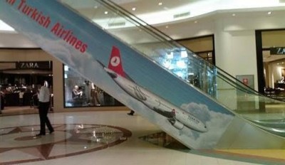
Who was a sleep at the wheel to make this ad?
Some advertising ideas can look great in concept, but not work out so great in reality. I am guessing the advertising agency didn’t think this one all the way through before designing an airline ad for an escalator.
Why design it so the plane goes into the floor? Why not point the plane up, going into the sky?
UPDATE: Steven with Flying with Fish told me the ad was taken down in two days. The ad agency saw it in concept and didn’t think about the reality of its location. Shelby (aka: @FlyAAway) sent me link of the ad from the other side of the elevator, showing the plane going up. A lot of people say any publicity is good publicity and really I think this probably has gotten Turkish Airlines some good publicity (and it isn’t even bad really).
Source: Flying with Fish via The Flying Pintoconnect | web | twitter | facebook |
Comments are closed here.