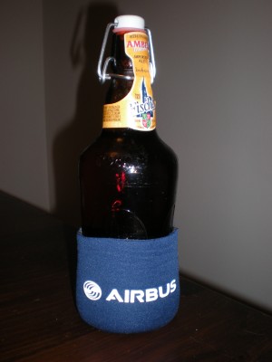
Check out this sweet Airbus Koozie with a French beer
Airbus has slightly updated their logo. It might take a true airline nerd to see the difference at first. Don’t worry, the iconic ball and the blue has stayed the same, however they updated the look of their font to be more modern.
Unfortunately, they didn’t have any large-sized version of the new logo when they announced it, but one Airbus employee (who I shall call Jon — since that is his name) sent me a nice koozie with the new Airbus logo.
So here you go. The new Airbus logo — I like it. I also like that French beer (yea, it is a little big, but it is the only French beer I could find). Time to celebrate the koozie! Cheers and thanks Jon!
Check this bigger and closer shot of the new logo.