There are a lot of you out there that aren’t too keen on United’s new combined livery with Continental. The more I keep seeing the new livery in photos the more I seem to like it. Not that long ago, I was able to view the new United livery in person at Boeing Field and I have to say it isn’t that bad. Although the new livery is growing on me, it can’t beat some of United’s liveries from the past. I have been hoping that United would be having a retro-livery themed plane and good news; they will.
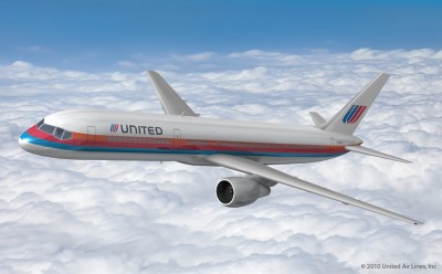
I have been asking to see the Saul Bass United livery to make a comeback, but after viewing some of their other liveries on a Boeing 757, I am not too sure anymore. We already know what the Saul Bass United livery looks like on a Boeing 757, but we don’t know what the others would look like.
United employees are able to vote until the first week of December. The Boeing 757 will remain in the retro livery until it goes into paint again.
UPDATE (12/13/10): The winner has been announced, see which retro United livery won.
VOTE: Which would you choose? (If you are reading this from the Seattle PI, click here to vote directly on the blog)
[poll id=”3″]
Comments are closed here.
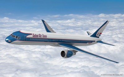
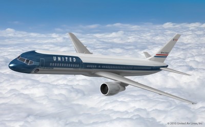
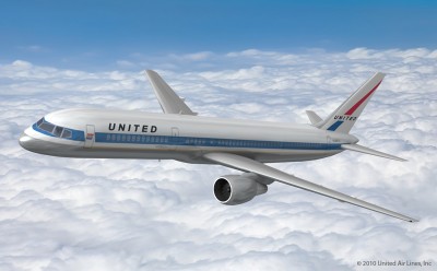
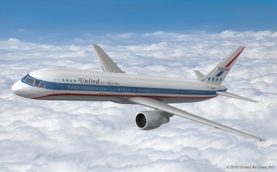
#3 was what was en vogue when I first flew on UA in 1968. So, that’s my vote.
I think every airline should have at least one retro livery all the time but that would never happen like US Airways’ heritage liveries.
Agreed. I wish more airlines would do more retro liveries. It would remind people how long that airline has been around in America’s history. Of course it would be hard for newer airlines :).
David
I like #4 the best, but it’s probably too similar to AA’s livery. Number 2 is pretty spiffy!
They already had a ‘retro’ livery, its this ‘classic’:
https://www.airlinereporter.com/wp-content/uploads/2010/10/a6ac7caf-f228-455e-9c15-bbd33b03c019.Large_.jpg
After all, its been around since 1991. If it were a car, it would be 5 years away from qualifying as an antique!
But seriously: #2 is true classic elegance and sophistication. It speaks to the golden age of aviation.
My favorite is #5 because the earliest look I remember of United Airlines when I was growing up was the Paul Sass livery from 1974 and my late mother was a flight attendant for United for 32 years. The first United aircraft I saw the logo were on Boeing 727s, Boeing 737s, Boeing 747s, McDonell Douglas DC-8s and McDonnell Douglas DC-10s. I also remember flying on 727s between Spokane, WA and Chicago, between Spokane and Seattle and on DC-10s between Chicago and Newark, NJ, a heavily-traveled route which will eventually see hourly service by United as EWR is now a United Airlines hub. New United Airlines needs to design a new brand that will be futuristic, incorporate both the Globe and Tulip logos to keep employees and customers of both Continental and United happy and have a lot of kick. Almost everyone hates the Globe and wants the Tulip to stay. The new brand should be chosen by travelers, not by backroom accountants, and United should hold a contest for the new livery in which leading entries will be voted on by customers. I know any new livery that keeps the Tulip will very likely be approved.
I am hoping that United will create a brand new look and livery after running with this new combined livery for a bit.
David
I hate the Globe too. The new livery is just plain ugly. I’m thinking that they kept the Globe because the CEO of the combined company is from Continental. Either that, or because the United brand is so bad these days and Continental’s is better.
I think #2 could work as the basis for an entirely new livery for the airline. That said, I’m one of the few who likes the current livery and wouldn’t mind it sticking around for a while. It gives me hope that the merged airline will end up more like Continental and less like United.
If you’re looking for a truly dated design… choose #1 or #2. I’d fly with #1 because the wings are painted. This is something not seen on American flagships.
The outgoing blue/gray livery looked good when first applied. As it aged, the planes looked like old battleships. I like the blue/white livery that United was in the process of applying before the merger. I am not wild about the new livery or logo. Keep the tulip!
The battleship gray was great. Lots of people have hated how dark it is, but I thought it looked classy. Of course United was very slow to re-paint them and there are quite a few battle gray liveries still out there. But most are quite faded.
David
Wow! I voted for the Sam Bass livery when this came out and it was at the bottom. Now it has moved up. We must be a bunch of nostalgic enthusiasts from the 70’s here.
Now with over 900 votes it is on top 🙂
David
#2 all the way. Classic and classy.
They all make me want to vomit.
You must have a weak stomach?! 🙂
David
Go Rainbow. I hope this scheme wins because it is awesome, and most of all, sends a message to Jeff Smisek that we want our Tulip to stay.
Defintely #1. It’s the only livery that even touches the wings or the engines.
The “Battleship Grey” is my favourite United Airlines livery.
I am glad United is going to use the 1972 livery, which contains the four stars. The four stars, as I recall from an article I read then, represent the four companies in the 1930s that formed United (one of which was an offshoot of Boeing) as well as the four stars on the flag of Chicago, which is United’s home town. This, however, is the second best livery they have ever had. The very best of the United liveries is the simple Bookman italic livery that preceded the four-star one. It most simply and directly conveys the glamor of “flying the friendly skies” that the airline promoted in those days.
I grew up on the tulip / Saul Bass scheme, so that would be my vote of the options given. When I graduated high school, I went to work for them for a short time – when they had the dark grey livery – I really liked that paint job, too – moreso than the older version.
The most elegant livery is the 2nd one, the one used on the DC-4s. It needs a slight modification: a U.S. flag should be added, preferably at the top of the vertical stabilizer.
They should have the Asian man United plane it would be called “dragged off”