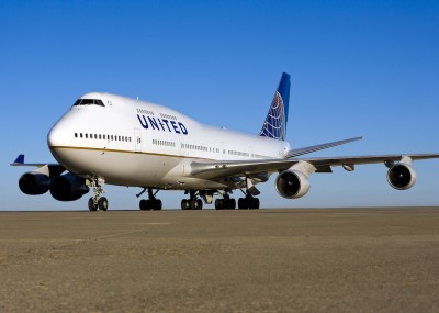
This Boeing 747-400 (N127UA) is showing off the new United Airlines livery. Click for larger.
Back in October I got a hold of what I thought was a photo of the first Boeing 747-400 in new United livery, but it turned out to just be a photoshop.
This one is the real-deal and I actually think it looks better than the photoshop.
Once again, I am finding myself liking this livery more and more. I know there are a lot of you out there that strongly disagree. Is it starting to grow on you guys a bit more? If it is not, I bet it might soon.
Thanks to Jon Ostrower (aka Flight Blogger) for posting this photo.
EDITOR-IN-CHIEF & FOUNDER - SEATTLE, WA. David has written, consulted, and presented on multiple topics relating to airlines and travel since 2008. He has been quoted and written for a number of news organizations, including BBC, CNN, NBC News, Bloomberg, and others. He is passionate about sharing the complexities, the benefits, and the fun stuff of the airline business. Email me: david@airlinereporter.com
https://www.airlinereporter.com
Airbus Verus Boeing: Twitter & Ads on the Tanker and Subsidies
My Review: Alaska Airlines Flight from Tucson to Seattle in First Class

I know this is personal preference, but I think if you look at the current (now old) United livery and compare it to this new one, you have to agree that the old livery has a lot more character and does more for the United brand than this new one. They missed a big re-branding opportunity with this choice.
I hated the old United brand and cringed every time I got stuck on one of their planes. I loved the old Continental. It was by far superior. When I see the Continental globe and colors, I am comforted by the hope the old United is dead and the things I loved about Continental may live on.
It will be difficult for a while. When you get on a new United plane, will it have TV? I am a big fan of airlines having a common image and brand. I am hoping the new UAL can make that happen sooner rather than later.
David
I hope the will have TV, but for now I would settle for the removal of the ancient GTE/Verizon Airfone from the old UA planes.
As a UAL Mechanic I am glad to see this new livery but most of all it’s nice to see a quality paint job. The old UAL paint jobs done were horrific and peeled right out of the shop. I hope it’s a sign of good things coming for the new UAL
A couple days after the plane rolls out of the shop I don’t really understand how you can judge the quality. Like many, I have seen some of the pictures of the planes that are half painted and half exposed, but I don’t think I have ever seen a plane like that in person, and most of my flights originate or terminate at a United hub (Of my 24 UA flights last year a total of 23 originated or terminated at a hub). And if I’m not mistaken, the planes are mostly painted in the same few shops.
I don’t have a dog in this hunt, but the criticism is interesting and often reflects on the critics.
Continental fans seem to accept the new livery as it incorporates the Continental tail.
United fans generally mourn the loss of the “tulip.”
Purists take issue with the size/font of the word “United”.
As for me, I bemoan the fact that the cheat line is perfectly straight, and wish it had some curve to it. I do like the gold, however. I also thing the scheme is too white. All-in-all, not the worst scheme I’ve seen, and not the best.
Until the whole fleet has been repainted in this “modified” (not “new”, in my opinion) livery, I will not be able to say if I will like this. Until then, I will always compare the modified livery with the current PMUA livery and it will still take time.
For now, it’s like putting the Golden Arches over the Burger King name and saying it’s a merger of equals for hamburger chains. Or what about the Swoosh logo and saying it’s now Adidas?
I’d rather they kept either the Continental name and their logo or the United name and their logo. At least that’s more uniform.
If they just left the Tulip preceding the word “UNITED” most parties would say that the total scheme would be acceptable to them!
No, that would be even worse than the current livery. I hate the new livery, I really liked the blue rising livery, but having the globe on the tail and the tulip by the name would look so stupid.
I DO NOT think this is a sign of good things to come at lease for Employees (especially, “old” UA ones that is) or Paxs. I think it was a BIG waste of $$$ to rebrand & NOT just keep the new UA blue logo (the one after 9/11). UA IS THE OLDEST AIRLINE IN THE WORLD & THE UA LOGO IS MORE GLOBAL RECOGNIZED AS A BRAND. There was a FB page started by a UA Pax to “Keep the Tulip”. Much cheaper to change the smaller of the 2 airlines logo then the larger because it is just NOT the airplanes but EVERYTHING from airport stuff, cups, napkins, mileage cards, stationary, uniforms, etc. Now you HAVE to change BOTH airlines stuff but of course there is MORE to change with UA.
Not the oldest airline in the world, but probably the most recognizable airline logo in the world, and it is a hell of a lot more recognizable that the globe. I wish they went with one or the other, not a “merger of equals” wherein almost everything is Continental except the name.
The hell with paint job…. we need a new 2011 wage contract
The hell with paint jobs…. we need a new 2011 wage contract.
Back to the future……How can a 20 year old livery be new? If ya think so I’ve gotta NEW 1990 car for sale for you!!
While the livery isn’t new (sans the name), for United it is new.
I saw and captured 744 in new livery at SFO on Feb 23, 2011.
Here is a link to my photo.
http://www.flickr.com/photos/jseita/5473171846/
Wow Jun, this is a great shot! Thanks for sharing.
David
You can use the photo according to CC license, if you want. I hope I could capture her in airborne soon.
Although I wished they had come up with a completely brand new livery for the new United, I’m to the point where I’m getting used to seeing this now. In fact, when I see a plane that still says “Continental” on the fuselage, it actually looks wrong to me – lol.
Don’t like it. Seems to show a total lack of creativity; just a mish-mash of the CO logo and the United name with a single gold stripe. The U tulip could have been incorporated small in the center of the globe. They could use more color too. It’s stark to say the least, except the tail. UNITED without the tulip is a generic word.
I hope they have done something with the INSIDE of the planes. The last trips I took to and from Asia, it was like riding in a public transit bus after ten years of non-cleaning…
Quote Shakespeare: Much ado….about nothing. And nothing to get excited about here. Possibly Gershwin + Ads can add some personality to the outfit.
I’d rather not associate with such a drab airline –United used to have class. Personally I prefer the AAlternative now 😉
If all you’re basing your choice on is a paint job, You’re fickle indeed. You should fly an airline for its superior service which United has always had. AA’s service has gone down the toilet since 2001, and Delta doesn’t even -have- a real first class anymore. It may not be flashy, and it is a shame to see the Tulip go after over 30 years, but Service is Key not Flashy Paint.
Terrible decision to keep the Continental globe as the New ‘United’ livery..This sickens the hearts of some of those folks who gave up so much blood, sweat, and tears for this company the past 15 years or so. The pride in the tulip is basically all that many of the employees of United had left..Thanks Tilton for selling them out. It seems CEO Smiesnik wants to tear down everything United other than the name. I understand keeping CO people engaged but how about United’s. I can’t believe that the upper management of United who are still with the company allowed Smiensnik to get away with all these changes..The New United is the old Continental pure ans simple. BTW, UA bought out Co shares almost 2-1, how can this be a merger of eqauls, it’s like comparing a Mercedes and a BMW when one compares United and Continental..