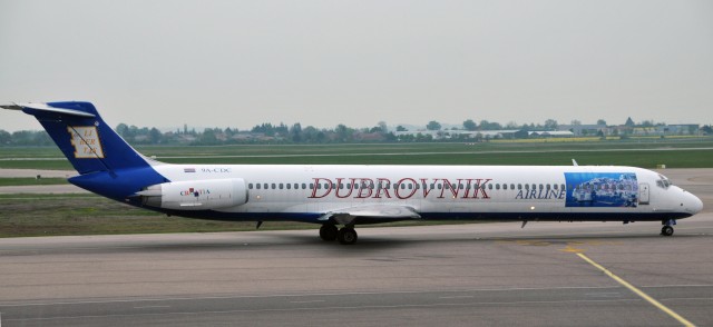
You might want to make sure that the kids are out of the room when looking at this livery — it is not pretty. A while back I put on Twitter that I think the worst liveries I have covered were Air Do and Air Midwest. I asked people if they had any that might be worse and @BrunetJohn stepped up with Dubrovnik Airlines.
For a livery to get on a plane, there have to be multiple people that approve it. I mean it costs the same amount of money to paint a good livery or bad one — which always makes me wonder how liveries like this every see the light of day.
Sure, the concept of putting a pretty photo to show where you fly is not a bad idea (and it is pretty — close up shot). However, this looks more like it was designed in Microsoft Word than almost any livery I have seen.
The word “airline” doesn’t even match up with the name and is oddly next to that picture. On the left side of the plane, it is no better with the name being oddly close to the picture.
According to Flight Global, the airline suspended operations on October 23, 2011. There is a possibility they could come back into service and I wish them the best — I only ask to think about going with a new livery.
There have been many times where I have dis-liked a livery and some of you have dis-agreed with me. Can anyone disagree with this one?
Image: Tab59

I really dislike Sierra Pacific’s livery. Every time I see a photo of one of their aircraft my brain tells me the photographer overexposed the top of the fuselage. However, this is just an optical illusion to the really annoying font they use.
See for yourself :
https://www.google.com/search?q=sierra+pacific+airlines
It’s not particularly ugly, its just an old, unassuming livery for a charter airline, but that font. It kills me.
I don’t know about the worst, although In general I think some of the legacy US airlines are taking too long to update their image.
BUT, for me, the best is definitely bmi, just a shame they may soon disappear.
For bad colour schemes Air Atlanta Icelandic take some beating. I know they fly a lot of ACMI (Aircraft, Crew, Maintenance & Insurance) ops for other airlines and repaint the aircraft for long contracts, but otherwise they just tend to leave the aircraft in whatever basic scheme it was in when they got it. Sometimes they repaint them in their special ‘Polar Bears in the Snow’ scheme (i.e., all white and boring from a photographic viewpoint)
It is a marginal airline and winderful livery is not a part of their operation. We’ll just hope that the critical parts are protected and that they clean the rest on a regular schedule. The visual is not impressive, but if they fly under serious safety standards, I don’t much care.
Well I kinda like it because I like the individual components. However, there are a lot of missed opportunities. If they had highlighted the photo down most of the fuselage, it would have been spectacular. They really needed a good graphics artist to tie it all together.
Any idea why they put a Lego block on the tail? 🙂
Well, THANKS VERY MUCH for NOT asking permission to use my picture!
I guess all decency has “left the building”?
What on earth is that god awful looking thing on the tail of the plane???