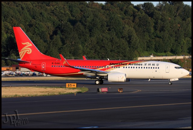
Shenzhen Airlines Boeing 737-800. Recent livery change means that it is hard to read the airline's name.
Shenzhen Airlines is the fourth largest domestic airline operating in China and started flying passengers in 1993. They have a fleet of over 100 aircraft, including the Boeing 737 and Airbus A320. Shenzhen is planning to have 180 aircraft by 2015.
The back part of their livery is red, with the front half white. They have recently made a change to make the red area longer, which works well in theory, but in practice it has caused problems with being able to read their titles. Looking at the older version of their livery, the full “Shenzhen Airlines” is all on the white. The new paint scheme puts the airline’s name partially on the white, but also partially on the red and gold striping, making it very difficult to read at a distance.
The tail sports the “National Roc.” According to the airline’s website this is “the totem aggregating the traditional and modern Chinese cultures. The design is harmonious and the colors of red and gold are gloriously lined with one on the other, agglomerating the soul of the oriental culture. Tallness and straightness, fullness of vitality, are the reflection of progress and prompt response.”
Overall, I think it is a great livery, my only suggestion would be to move the English titles back onto the red and make them white.
Photo by Jeremy Dwyer-Lindgren
If they weren’t in the process of joining Star Alliance, I would have never heard of these guys…
Fully owned subsidiary of Air China.
I would suggest leaving the Chinese characters where they are, and move the English titles below the window in the white like the titles of Alaska and Horizon Air.
Great blog. I live in Guangzhou, China and have seen this airline at airports several times.
Given the problems that red paint causes (i.e. NWA bowling shoe livery), I’m surprised to see them expanding the red.
Perhaps someone more knowledgeable than me knows if there has been a significant improvement in paints.