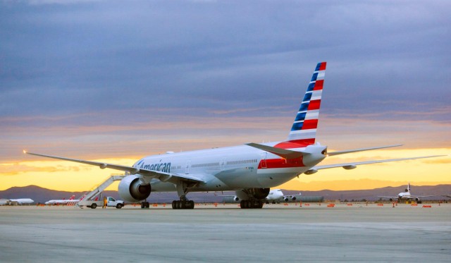
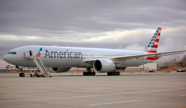
American Airline’s Boeing 777-300ER is shown in new livery. The aircraft (N718AN) was painted at Victorville Airport (VCV) in California. Check the classic Delta L1011 in the background. Image from American.
Next week American Airline’s first Boeing 777-300ER (77W) will fly from Dallas (DFW) to Sao Paulo Brazil (SAO) on the 31st of this month (which Chris Sloan from Airchive.com will be sharing his experience with AirlineReporter.com). Before then, it needed to be painted in American’s new livery and now it has. We have seen computer mock-ups of the 777 and a real 737 in the livery, but now we can see the 777-300ER in its new threads. The big question: Is it growing on you?
Other American Livery Stories:
- American Airlines Boeing 737 in new livery at JFK
- Some additional thoughts on American’s new livery
- American Airlines unveils new look, livery and logo
- Is this Boeing 737 prepped for American’s new livery (we know now the answer was yes)
Now, American is pretty good at making interesting videos. I would assume that one is in process showing the 777 being painted, so maybe we will be seeing one soon.
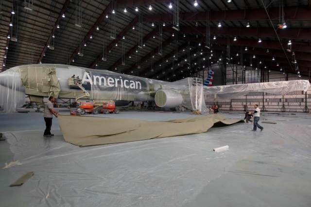
American’s Boeing 77W inside the paint hangar. Image from America.
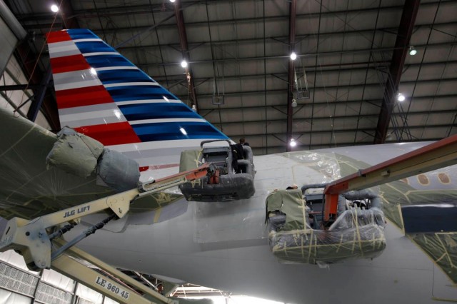
The tail seems to be many folks least favorite part of the livery. Not quite sure why. Image from American.
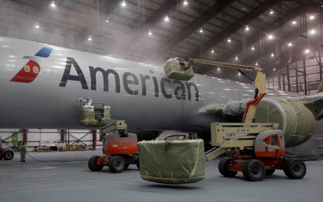
American Airlines 777 being painted in Victorville. Image from American.
The 77W looks ready to fly. Check out the Wi-Fi antenna up top. Image from American.
Want more? ADDITIONAL AMERICAN AIRLINES BOEING 777-300ER PHOTOS via their Facebook.
It could easily be considered AAwful or AAwesome. Your choice.
How about just “AAwe?”
David
I actually like the way the white titles look over the navy background in the 2nd photo. But who cares what I think? 🙂
I do Paul — I do 🙂
David
AAwful doesn’t even come close to being the right word for this tragedy.
Definitely growing on me already. Thanks for the continued great coverage!
I like this New Livery….
I do think that the Tail is looking awesome.
The tail looks like it belongs to Team America World Police. As someone else previously commented, “AAwful doesn’t even come close.” I’d be embarrassed to fly an airline with this kind of livery to a foreign country.
I agree with the observation that the white “American” lettering on the fuselage looks good, though I don’t mind the look AA chose for that. I wonder if FutureBrand (the design firm) and AA evaluated any designs using white lettering on the fuselage?
AAw crap…
Tail is gaudy and fuselage is boring. A can of beans has more style.
i really want to hate it, but i just…. don’t
I just love it more and more, and seeing it on the 777 makes me love it more. Then again I am somewhat partial to the flag in any form as a military member.
The ‘Logo’ should symmetrical, not offset…
Don’t really care for it.
The scheme seems to be blue, white, red. I am used to red, white, blue. Maybe just my thinking, but it seems “backwards” so to speak.
I like it. The gray on the fuselage is a little plain, but I like the overall look.
Now…bonus points for identifying the other planes in the top photo. We have an L1011 at the top right, and there is either a 744 or a 748 behind the AA plane.
Another 747 is to the rear right (can’t tell the series at this distance), and what looks like at least one Northwest plane.
Still sticking with: The LOGO was robbed from Greyhound Bus. About as complex a logo as Vueling and others… Something that is very different would be good, like the NZ All Blacks; understood to hot for all black in most AA cities but something outside the box…Oh well this won’t last long will have to re-brand if a merger or WN, UA, and DL will squeeze AA out in a couple of years….They could have gone all white with block letters like the old days or Ryan Int’l etc does now, to make it easy to re-brand when liquidated….Just my 0.0002 cents..
This new livery looks so “vintage”… B-18 Bolo in pre-war colors
I think the tail looks great. What is there not to like about our flag? If you look closely enough, there are 6 red stripes and 7 blue, representing the 13 original colonies. The alternating colors close up give the impression of moving quickly; viewed from afar, looks very much like our proud. and very American flag. There is nothing “low cost carrier” looking about it. It is our flag and I love it.
Has anyone identified the Delta TriStar in the background? It seems unusual that it is that close to the tarmac area.