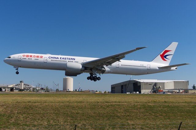
Brand spanking new 777-300ER at Paine Field showing China Eastern’s new livery – Photo: Bernie Leighton | AirlineReporter
Behold. This is probably the worst airline livery that I have ever seen.
China Eastern didn’t have the best livery to begin with. But at least it was a livery. Their new colors, shown off on this 777-300ER, look more like a leased plane where they don’t want to spend the money to paint the plane than an actual livery.
But what you are looking at here is China Eastern’s official new livery. It will be going fleet-wide (unless they come to their senses). This is the first of 20 new 777s that the airline plans to take delivery of.

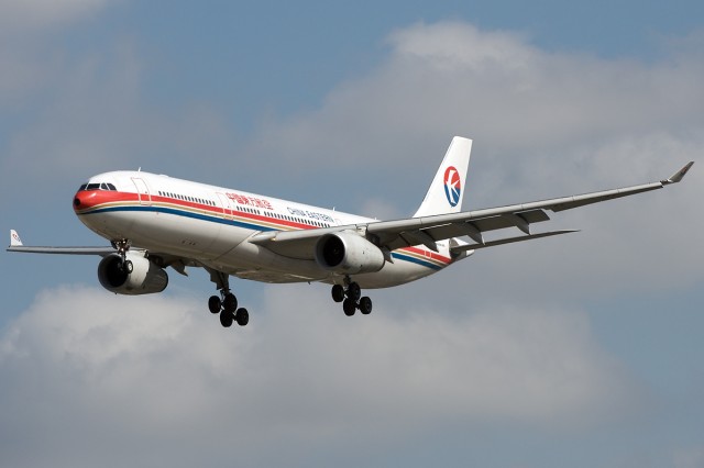
China Eastern Airbus A330 in current livery – Photo: Bernie Leighton | AirlineReporter
I am not quite sure how a company can conclude that this is a good idea. Let’s not bother with a creative design down the side or even care about having more than three colors. Let’s just workshop some horrid livery in Microsoft Word and call it a day.
I really, really hope that the airline re-considers this design. Please.
What do you think of this livery?
Why? It’s simple, to the point.
Don’t you know “keeping it simple and stupid?” And “less is more?”
Worst Is very strong. In fact it looks fine to me. What wrong with it? Might be useful to know solid reasons why it’s so bad.
Gee, can’t lose sleep over this – looks exactly like JAL, and other all white carriers flying – very minimalist. Funny the less on these liveries, the more worked up we can be! Now, can I get back to that American Air new livery battle – now that’s something to put your teeth in.
Agreed, I am very disappointed with the new livery on these MU birds. They had a chance here to break free from the mostly crummy liveries seen on almost all Chinese carriers and they went with Microsoft Word clipart.
The upside is, yes it does look a little more modern than the old one, especially with that black radome detail. It reminds me more of a cargo plane than a passenger plane though, which may be forebearing what is to come 😉
I get that you’re trying to save money wherever you can, but this is just ridiculous. It’s just so bland. I’m falling to sleep just looking at it.
Even worse and less inspired is the United / Continental merger hack job.
Its actually beautiful – very 60’s minimalist. Far superior to any US airline!
Well….I quite like it. I agree with Bill, very 60’s minimalist.
Air NZ very nearly went ‘minimalist’ too.
Third pic down on this link shows what the new ‘black tail’ livery would have looked like. Luckily we know have one of the worlds best livery! 🙂
The old jade/blue livery was lovely for its time too but that was then, this is now! Esp for an airline that’s just announced another whopping profit!
https://www.airlinereporter.com/2013/06/air-new-zealand-shows-off-new-livery-times-two/
http://www.nzherald.co.nz/business/news/article.cfm?c_id=3&objectid=11314860
Absolutely ugly. Joining Japan Airlines club. At least more color on the tail like a dark background or something, How I miss the cheat line. As for Grayson comment on Air New Zealand as world best livery, its an eye catcher and has color, but the jade/blue colors should have remained instead of black. not the best in my opinion
I see nothing wrong with it. It looks clean without a lot of noise.
Don’t see anything wrong with it – clean, simple, basic.
Besides, this airlines is hardly targeting me as a potential flier. Maybe the simplicity of design appeals to the billion Chinese that are its main target market.
Looks fine to me, superior to the old livery for sure. Simple, clean, elegant. Nice tail feathers. Maybe the “most simplistic livery ever,” but not “worst.” Not the most creative, but not the worst. Probably saved money in design and application and might save weight and maintenance costs.
Talk about bland. Logo is fine, but the fuselage – no imagination whatsoever. The old livery was really colorful. This is boring.
Not only is it a huge step back in terms of the basic design, the tail looks way too much like Malaysia Airlines logo. I’m baffled why a Chinese airline would want that right now.
It’s merely an all-white paint livery, which I suspect is incomplete.
Since this is the first Boeing 777-300ER for China Eastern, it is possible for the airline to finish painting the aircraft in Shanghai.
“Worst airline livery ever”? Right.
I think the “new” United is the worst flying.
” White is light ” is what our Boeing Tour Guide told us; a few years ago, when a buddy and I took the Boeing Tour @ PAE. She told us that the dominant ” color ” of airline liveries is white. White paint is lighter than mixing paints together to have a multi-colored livery. A lighter airplane means less fuel is burned; less money spent on ” gas “. I’m not a aeronautical engineer – but that seems right to me. Perhaps other plane geeks can confirm this?
China Eastern,and other Chinese airlines,have a lot of colourful logojets.
Maybe basic white fuselage makes for easier application of colourful themes that can be applied and replaced when necessary.
I don’t see much wrong with the livery. Actually, honestly, JAL’s worse and it’s more plain: only red, white, and some black…
As long as the airline maintains their machines properly, employed SAFE flight crews and does a reasonable job with the inside, ‘soft,’ product, I do not much care about the paint job. Does it change the flight? I’ve flown China Eastern only twice, (In a “J” seat) and was neither impressed or displeased with the soft product – they covered the basics reasonably well. Would I ever choose one airline or another based on the paid job? You’ve got to be kidding. While some standard liveries do have eye appeal, I think the expense is wasted marketing money. Does the paint job really matter?
You seem to have no idea about the impact of such a livery change in the
vast country that China is. A completely new delivery would mean years of
changing and double views, despite the best efforts. Also, is it not clear
that in chinese eyes the solid and conservative look could just count on a
vast approval. Your opinion can be heard, but be careful not to impose it
without some wider expertise.
I dunno. I think it’s a nice retro throwback sort of a design. I’ve seen worse.
Is it the worst? It would be if it fell under the “livery” category.
But it’s not.
It’s something that a leasing company would slap on for a Hajj season short term charter to a major carrier.
Or something the airline would put on a leased cargo aircraft.
Or something a charter carrier would use for flying 500 pax on low cost flights from Europe to Punta Cana or some such place.
In short, it’s rubbish.
Have you seen a Chinese Airline with a beautiful livery?
All of them are plain awful and very unpleasing to the eye.
Hainan, Air China, China Southern,China Eastern….,Macau Air
The ugliest designs in the industry for sure!!!
Look at Cathay Pacific-simply beautiful,but it is not Chinese as far as I am concerned..
I love the Cathay Pacific “brushstroke bird” on the tail of their planes.
It says “flying” and “China” all in one image. THAT is a nice logo.
Any change was welcome, the old livery was the worst already.
The new Iberia livery is also very simple and plain. http://www.underconsideration.com/brandnew/archives/new_logo_identity_and_livery_for_iberia_by_interbrand.php
Well, frankly I like stripes down the side of a Jetliner, like they used to be in the 60’s & 70’s.
Sure looks better than that new design American did on the jets a year ago with some half baked design of a flag on the tail.
These all white boring looking Clinical looking aircraft are getting disgusting and not very pleasing to the eye, a lotta what I’m seeing reminds me oof being in some Clinical Experiment, everything is just white, the outside, the insides, gone are color & style and actual worthwhile designs, like there was in the 60’s & 70’s.
I liked the old colors of Continental, PSA, Eastern !
Aside from being YAWL (Yet Another White Livery), it’s an update. I don’t understand WHY white has become the go-to basecoat for just about every airline out there, but I’m also not in Marketing.
Meh.
Now, you want to talk *ugly*, let’s talk about the new Southwest logo. That looks like they hired a bunch of guys from the Fisher-Price toy company to design that stinker.
IIIIIDONKNOOOOW???? The yellow Spirit one gives me a migraine headache.
I love the HAINAN groups different liveries – it has a beatiful “chinese style” and i have always loved China Eastern & Southern, two cool “oldscholish” liveries, i don’t undrstand why CE has chosen this very boring white colored one? – hopefully someone in CE will change their mind, like AIR INDIA did some years ago with their “new liveri”…and come up with something, just a little bit more “creative” 😉 Sugiii
Ugliest livery is Air New Zealand’s new one – no colors, just black and white. Uggg
For me, most unimaginative scheme of the year is a toss-up between Spirit (Hertz scheme) and that dreadful China Eastern whitebody. The latter scheme baffles me completely when so many other airlines in Tthe PRC have such colourful liveries. Spirit underlines its business model – CHEAP
it’s been said already – 60’s and 70’s – even singapore airlines — same thing -yuk