On my recent trip to Chicago with United to experience their new United Club cuisine, we were shown something that the airline had been working on. Something that would have been obvious to so many, but that not so much to others. United has been working on many different ways to improve their boarding experience.
We have all had a bad boarding experience. A delayed flight, people massing at the gates (gate lice), no order at all, bad communication, and confusion. Airlines all board aircraft in different fashions, and each airline has someone (or a team) of people, who are consistently re-evaluating how the boarding process can efficient. Some new methods work well, others are silently stopped and never spoken about again.
But what is sometimes forgotten about in the boarding process is what that gate area looks like, how it is handled, and how passengers actually feel about it. United has decided to take a look at all of these factors and decided on trying a new boarding experience — one where even passengers had some role in the decision-making process.
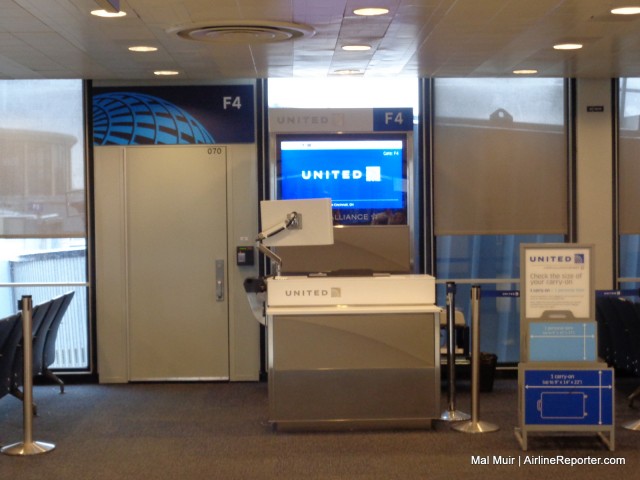
United’s new podium design means that the staff can be more approachable and allow a better experience with the passenger
Chicago O’Hare is an airport that is dominated by United. It is one of their primary hubs and is also the hometown to the airline. What better place to do some research, and decide on the new boarding experience and gate design for the airline?
United already had some of their updated designs being used at a number of gates at O’Hare and they seem to make a statement. Before the overall design was decided on, they had already put out new podiums and signage at many gates. The new podiums are built at a lower height, allowing the gate agent to feel more approachable. They have installed nice flat panel monitors on easy-to-move mountings, so that they can turn the monitor around and show the customer instead of their typing being a secretive process.
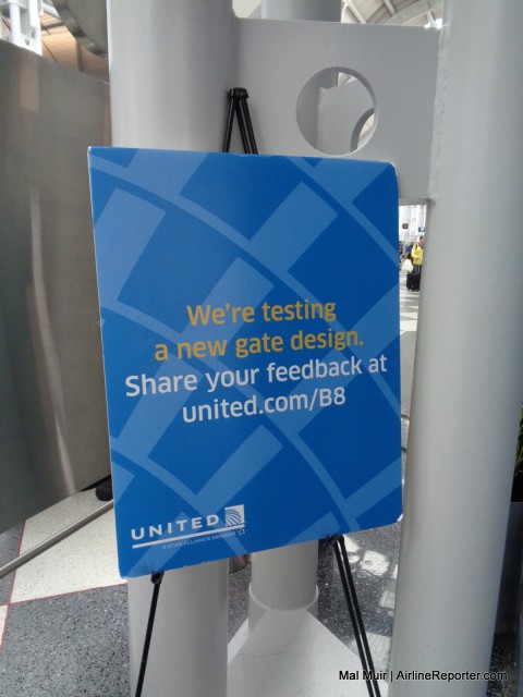
Getting passenger feedback on the new gate designs means that the traveling public can say what they do or don’t like.
During the testing phase of the “new gate,” United set up several different areas with multiple versions of what they wanted to implement. The goal was to see which one worked the best in a real-life situation. This is a great win for the passenger, as airlines can now see exactly what we have to say about something we experience.
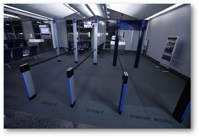
The United boarding process will now be easier to understand, with clearly-marked boarding lanes – Photo: United
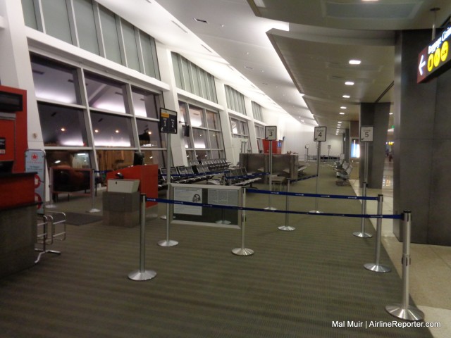
The change to the boarding experience comes from the way the gate is designed. United uses a “Group” boarding process, with Group 1 for higher-tier elites and first class, Group 2 for lower-tier elites, and other early boarding groups and rolling on down to Group 5. In the last 12-15 months they have begun to help separate these groups in the gate area, but in some cases it just did not go far enough. United has taken it to the next level and have clearly created five boarding lanes now.
As you can see in the image above, they have some poles that are very ’œSouthwest-esque’ however unlike Southwest these are not there to stand next to. These become the start of the boarding lanes, and with a retractable belt at one end, they can open and close the lanes as needed. This is a great way to end that boarding mess and means that if you are Group 1, you are not fighting through the people lining up for Group 5.
Some of you might think that creating lanes for boarding is bringing you back to feeling like children, lining up going to school. But it actually creates order and means that you are not having to feel stressed in working out who is boarding when or in what order. Everyone and everything has its place.
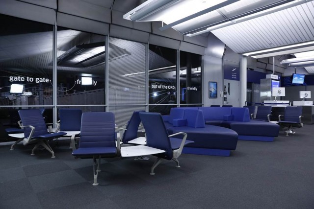
The final part of the boarding experience puzzle is the waiting around in the gate area. Gone are the days of the hard metal or plastic benches (or even ones with slightly crappy cushions).
United has introduced different types of seating to the area, from comfortable, couch-like seating to the standard row seating, to even bar-height seating. The one thing that is common throughout is going to be outlets – lots and lots of power outlets!
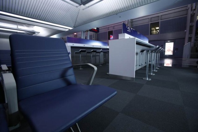
The “Power Bar”, as United has termed these bar-height counters, means you can charge your devices and be productive at the same time – Photo: United
United has been criticized by many (even us) for being slow of updating the passenger experience post their merger with Continental. But it looks like the airline might have found its stride and are trying to improve. With an airline so large, it might not come quickly, but it is nice to know that at least it is coming.
Note: United provided the author’s flight to/from ORD and accommodations during his visit all opinions are his own.
Nice piece Malcolm;
As huge as UA is, it’s amazing that creative changes can actually be made .. ..
With some raving about the BISTRO-ON-BOARD, UA better watch out ~ They’re making the inflight experience better, and better .. ..
Keep up the good work UA .. ..
I read, and read, and read, and then I saw what I was looking for “… lots and lots of power outlets!” Thank you, United! I don’t care about the aisles. Some people will still not get it, I’m sure. Great piece, Mal!
Thanks Temo
Why don’t they have 2 boarding lanes, one that is currently boarding and the other one the next group boarding?! Then they don’t have to occupy that space just to fill in those 5 boarding lanes. People are already seated anyway. Let them stay where they are until their boarding lanes are called. They do a have a big screen anyway to show what lane is currently boarding.
Good that they are adding outlets. Outlets are becoming high demand with all the gadgets people have.
I would like to think the travelling public could do that, but we have seen at present that is not possible. It is not so much the airlines, but the passengers as well. The two lane process just doesn’t work when people want to crowd the area. If they want to line up (which they do no matter what because they want to feel special/important/be on first) then let them line up in the lanes and keep everything in order.
I have been flying since I was 6. People have never sat and waited (well, a handful do…regulars) for their turn. Most people don’t even wait for an announcement to board…they just start congregating around the gate. This causes congestion, and prompts the people in Group 1 or 2 to get up early too…because they do not want to fight through the crowd. Yes, it would be great if people could follow direction and logic without being prompted, but I have never seen it in almost 40 years.
It’s because the airlines started charging for bags that everyone is scrambling to get on board to get overhead space.
That made it worse, but that is not the main reason.
Stay tuned, more changes coming and just maybe someone heard your idea of just 2?????
Whoever is Uniteds person or architect, or picks out the colors for the seats and walls has no sense of Style !! Its too Drab and Dull & boring looking. add some stripes across those blue seats, and on the carpet and walls.
Dunno’ about some of these Corporate people, who lack style and class.
With style comes cost. I’m sure the designers would love to add other colors, stripes, etc but think of how much incrementally that is going to affect the cost of inmmplementing that stripe design, then multiply that times the number of gates at every airport. Even if it was $100 more per gate, that incremental cost is huge. That’s where corporate accountants and expense teams weigh in and say “lose the stripe design and make it all blue to bring the cost down”.
Completely agree with Jetranger. However, I think the drab has more to do with United’s current dull logo and color scheme. Compared with the other major carriers that recently updated their livery, United’s current design seems juvenile and is difficult for any designer to have to work with.
What do stripes on a seat have to do with “class”. Personally, I find too many patterns and stripes tacky. I prefer something neutral when traveling.
It would depend on what kind of patterns and colors you’re talking about. If it can’t be done in good taste, (and who’d be the judge of that?) it’s better to go with a classic look. IMO, stick with the cool colors,blues, greens, greys, (no reds, oranges, etc.)
Excuses , Excuses, & Rhetoric, well then, maybe they could cut the cost of Advertising in some Magazines I see at the Grocery stores and Radio Advertisements, that are plenty costly, huh !!
Since their ordering in Bulk for so many gates as you put it, I’m sure the Discount would be great and not all that costly as you’d think 🙂 !!!
Pre-merger, United learned that the battleship dark grey color scheme that they adopted portrayed a dull look that reflected the past. They then came up with a very inspiring, fresh and uplifting color scheme. It appears that post-merger, Continental executives failed to learn United’s past lessons and repeated the dull grey with this current color. The dull and darkness in the new seating area pictured above along with the picture showing the lanes is so depressing. It is like going to a funeral.
Will United be adding induction loops for people who are hard of hearing to enhance their gate experience. Airports around the world including but not limited to in The Netherlands, UK, Russia, Turkey, Poland, Israel, Hong Kong have induction loops. Why not in the United States? United, the friendly skies need to be friendly to people with hearing loss.
Janice S. Lintz, CEO, Hearing Access & Innovations
One of the biggest problems is that people don’t look to see their actual boarding group
So I paid $400 for a club card and am also a gold level flyer and I still have to stand in line with pretty much everyone else. Sometimes I wonder why I am loyal to United..
Peggy, you are so right! I have the Presidential Plus Card ($400/yr) and just moved up to Gold level. I couldn’t believe that this still gets me Group 2. I’m really thinking of dropping down to a lower cost credit card that will still get me Group 2.
The whole process is ridiculous. Boarding the plane from front to back is the dumbest thing ever. I don’t care how many groups you decide to have. You should always board from back to front with window and center seats before aisle seats. When a flight is on time the process is cumbersome. When a flight is running late the process of climbing over and past people is unnecessary and costs precious time that may be needed at the destination to make connections. The process should always be efficient so that whether the flight is on time or not it is less cumbersome and much quicker.