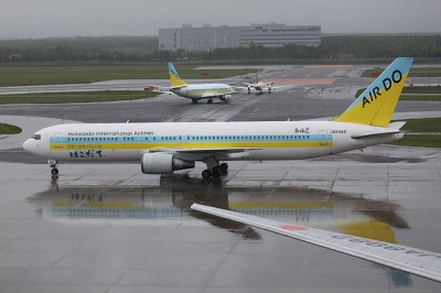
While hanging out at Haneda Airport in Japan I saw one of the worst liveries I have ever seen. Air Do or Hokkaido International Airlines has a livery that looks like someone designed it in Microsoft Word.
Now, I don’t normally mind the classic looking cheatlines going down the side of the airplane, but look at them. They are just there. They don’t blend into anything or go around the entire aircraft. Who thought that tail design was a good idea? Split in two colors, not attached to the cheatline and a very simplistic black font showing Air Do.
Someone had to design this and others had to approve it. How could this ever happen?
The airline was founded in 1996 and started flying in December of 1998. It was started by a successful poultry farmer (maybe that explains the livery) and is mostly financed by the Development Bank of Japan. They only have 10 destinations and nine aircraft. Their fleet consists of Boeing 767’s and Boeing 737’s.
If you want to book a flight, don’t count on Air Do’s English version of their website, it isn’t too helpful. Has anyone flown on this airline? Is at least the services or prices decent?
Image: zotake