-

-
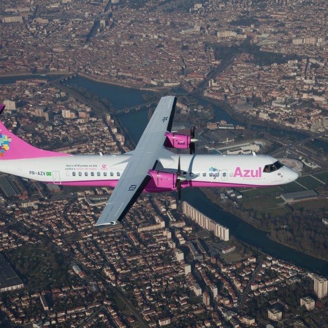
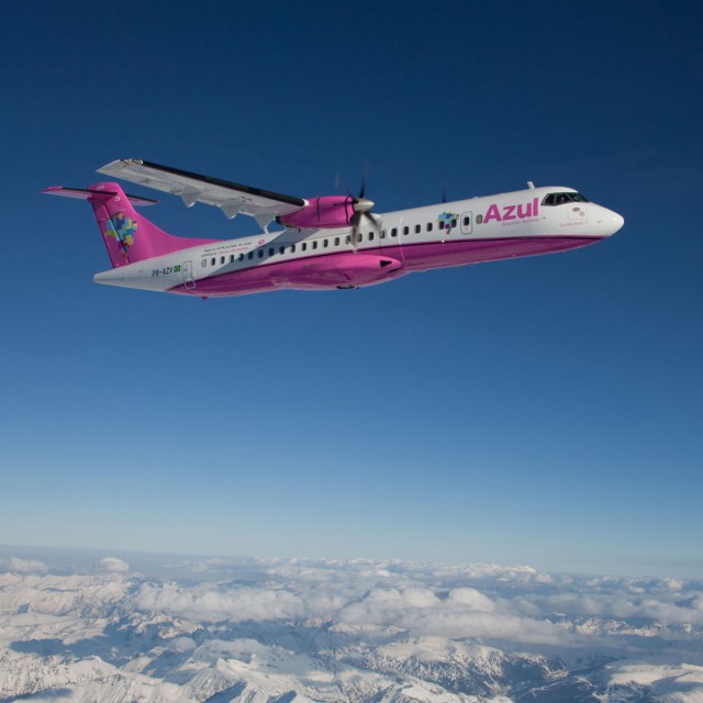
Azul’s new ATR 72-600 (PR-AZV) in pink livery
-

-
The pink livery looks great contrasted to the blue sky.
-

-
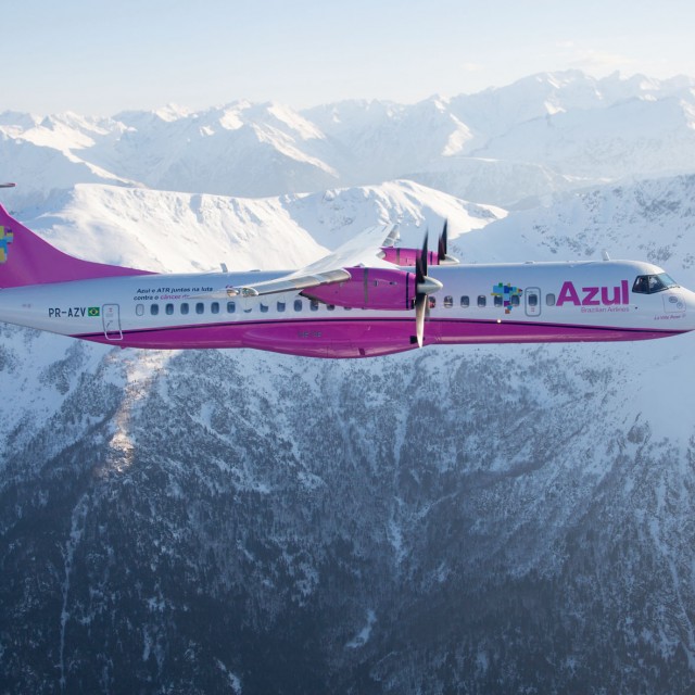
The pink liveried ATR 72-600 (PR-AZV) over the mountains
-

-
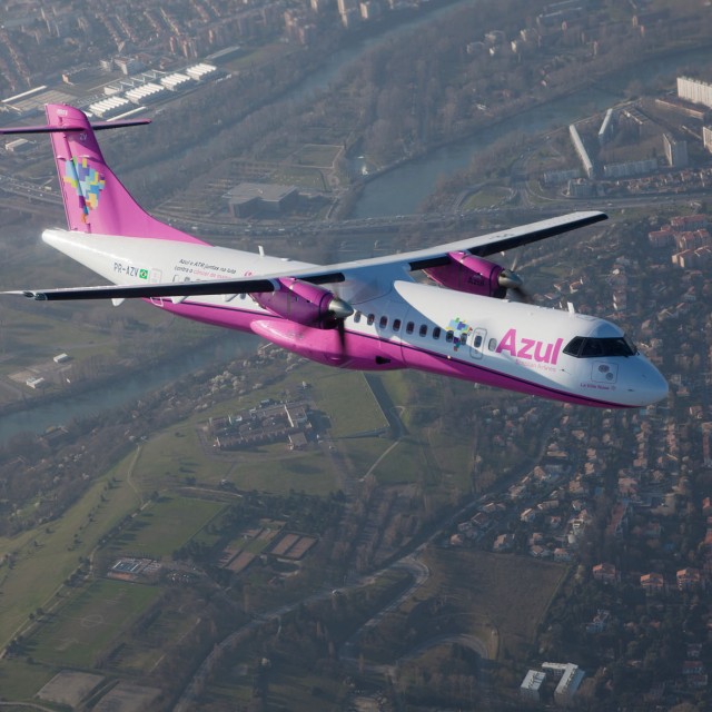
Azul’s new ATR 72-600 (PR-AZV)
Click any photo for larger version
The word “azul” in Portuguese means “Blue.” This is odd for two reasons. First, this special livery is pink and the airline was created by David Neeleman, who was the founder and former CEO of jetBlue.
The airline started service in December of 2008 and has a fleet of 28 aircraft, consisting of Embraer 190s, Embraer 195s and a few ATR 72-600s. They fly to 30 destinations with more than 200 flights be day.
In the next few months, they will be taking delivery of 20 new ATR 72-600s and recently, ATR delivered a pretty-in-pink aircraft to Azul to help promote breast cancer awareness. In a recent ATR press release, they state, “On its fuselage, the aircraft will promote FEMAMA, a Brazilian non-profit organization dedicated to fighting the disease. In addition, ATR and its suppliers involved in the organization of the delivery of the aircraft will contribute funds for the Toulouse Cancer Campus.”
Although pink is not my favorite color, I think it looks good with Azul’s livery and actually I think the pink makes the plane pop a bit more than their standard blue livery.

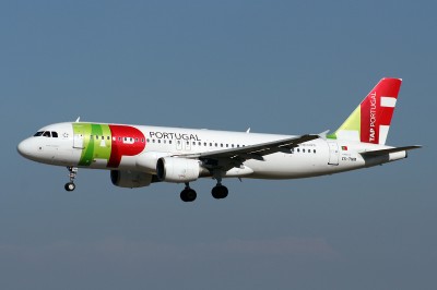
TAP Portugal Airbus A320 (CS-TNM)
So what the heck does “TAP” stand for? When the airline was established in 1945 it stood for Transportes Areos Portugueses. In 1979 the name was changed to TAP Air Portugal and finally it was simplified to just TAP Portugal.
TAP has an all Airbus fleet of A319, A320, A321, A330 and the A340. They also have 12 Airbus A350s on order. The airline flies to 65 destinations in 31 countries via their fleet of 66 aircraft. They also run a regional airline, called PGA, with 16 additional aircraft.
The livery overlaps the TAP on the front of the fuselage and mostly just has the “P” on the tail. This gives it a clean and unique look, especially with the “TAP PORTUGUAL” going vertically up the tail.
Image: Guido Haesevoets

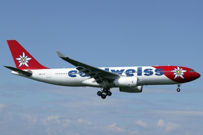
Edelweiss Air Airbus A330-200 (HB-IQZ) with flower livery.
At first glance I was not sure if it was a flower or some odd nuclear atom on their plane. Either way, I kind of liked it. When taking a closer look at the Edelweiss Air, it became quite clear this was a flower.
The airline is named after the unofficial state flower — the Edelweiss. The airline was founded in 1995 with a single MD-83. In the late 90’s they introduced Airbus A320’s and Airbus A330’s for longhaul flights. The airline flies from Switzerland to destinations in the Mediterranean, the Canary Islands, the Caribbean and the Maldives. They also fly to locations in Africa, the US, Asia and Europe.
In 2008 the airline was bought out by Swiss International Airlines, which was bought by Lufthansa in 2005. Even though Edelweiss is owned by Lufthansa, it is still independently operated. They currently have no aircraft on order, but did just take delivery of their first Airbus A330-300 on January 16, 2011.
Image: YR-DIESEL

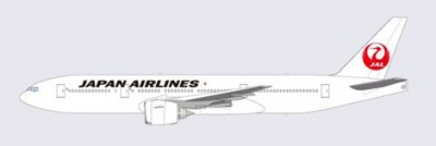
Really? This is the best they can do? So much white and a little too simple for my tastes. This is JAL's next livery.
This new livery from Japan Airlines (JAL) is a bit of a shocker to me. Earlier in the week, I started to see people talking on the web about JAL changing their livery and adding the historic crane back. I have actually like JAL’s current livery and was surprised to see them announcing a new one already. Then I started to see the drawings of what the new livery was supposed to look like.
At first I thought, “no way, what person did this mock up and showing it around the web?” It almost looked like someone made a custom livery on their home computer. So, I headed to the source and JAL’s press page. Holy smokes, they have the same mock up of the new livery. I am a little shocked that the mock up isn’t a little more professionally done, but I guess at least it gives us a good idea what it will look like.
At first I thought this livery was a horrid idea. Going from a pretty trendy looking livery with a nice cream-colored base to bleach white with just a crane and black titles. After some time looking at it, I don’t know what to think — I might have to wait until seeing it in person. It seems like it is very, very plain, but it might have a good enough retro feel to work. I think a clean red cheat-line might have brought it all together with a little update to the crane.
It seems a little odd to me that the company would be spending so much on a re-branding during a financially difficult time, but they are hoping it to celebrate the changes. The new livery will first be seen on a Boeing 767-300ER and I will for sure be looking for her in person to see how it turns out.

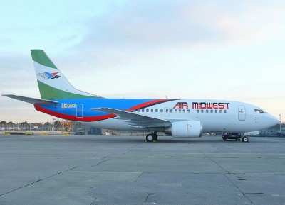
Air Midwest (Nigeria) Boeing 737-500 G-GFFH with taped on registration numbers.
Air Midwest Airlines was founded in 2002 and is based in Lagos, Nigeria. Even though the airline was founded in 2002, it wasn’t until February 2010 when the airline started its first flight. Currently they only fly to two destinations using a single Boeing 737-500, although their website does show they own three Boeing 737 aircraft (two -500’s and one -300).
That being said, I think they have a horrid livery. The tail on its own is ok, the back of the airplane is ok, but the front I do not like at all. Put them all together and you have one bad looking airline livery. The font and the colors of its name just doesn’t match the rest of the livery. If you have to pay someone to paint a plane, why not make it look decent or at least not bad? On their website you can get a better view of their logo, although I am not sure what it is supposed to be. Talking about their website, if not having green, white, blue, red and black as colors, their website has an orange background.
