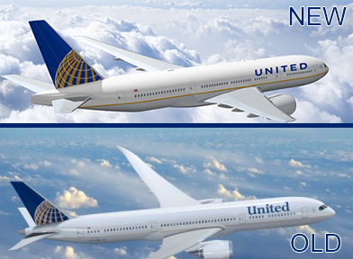
The old and new combined livery for Continental and United Airlines
When United and Continental announced their new combined livery, a lot of people were not happy about the font used for “United.” Well, they must have heard, b/c they have changed the font and I like it!
From their merger site: “The new logo displays the combined company’s brand name in capital letters (UNITED) in a custom sans-serif font, joined with the global mark which has represented Continental’s brand image since 1991.”
This doesn’t help those that will miss the United tulip, but I think this is a good compromise for both brands.