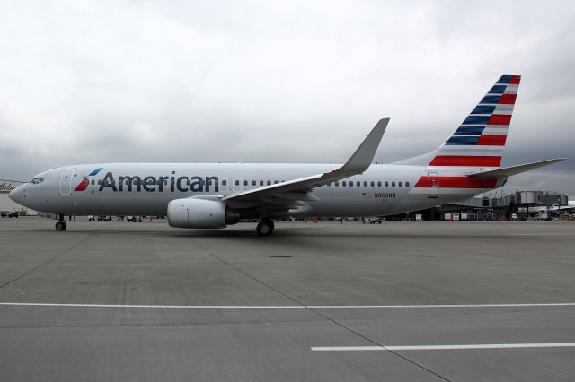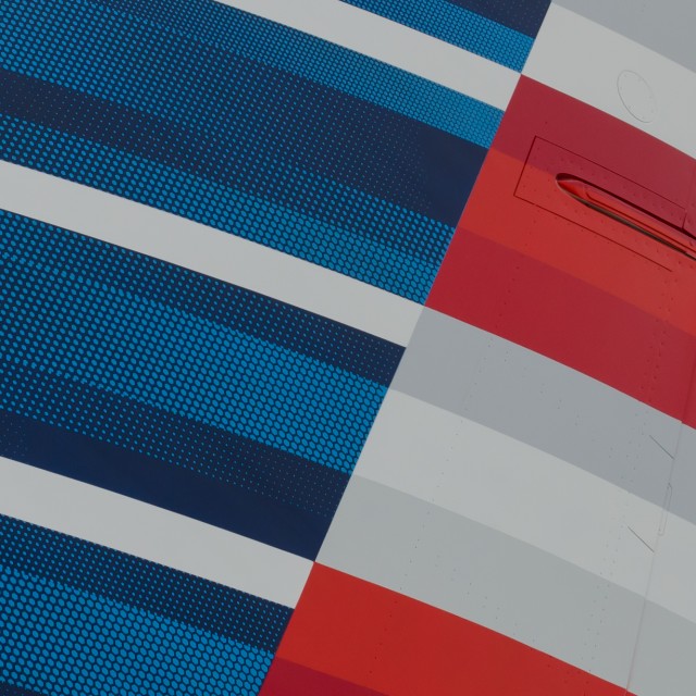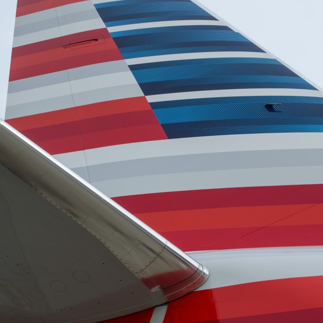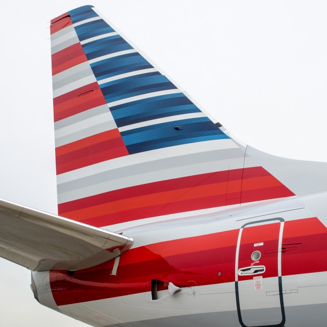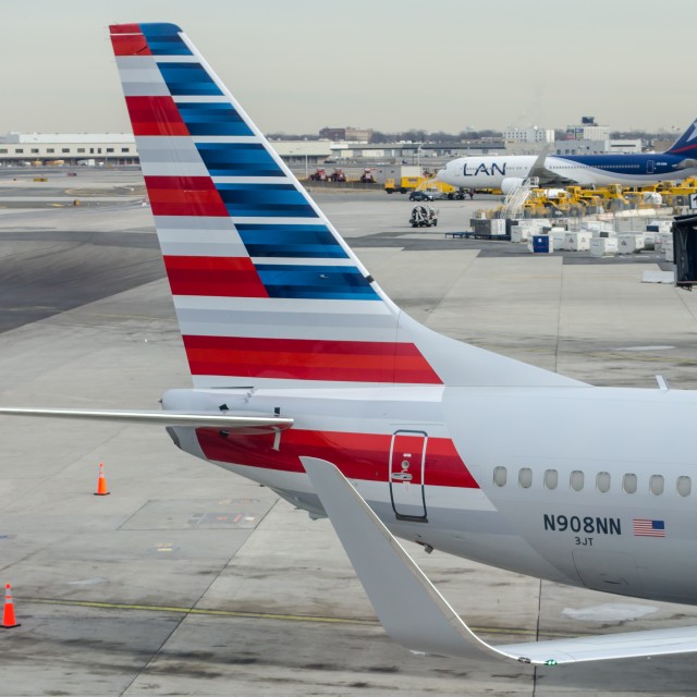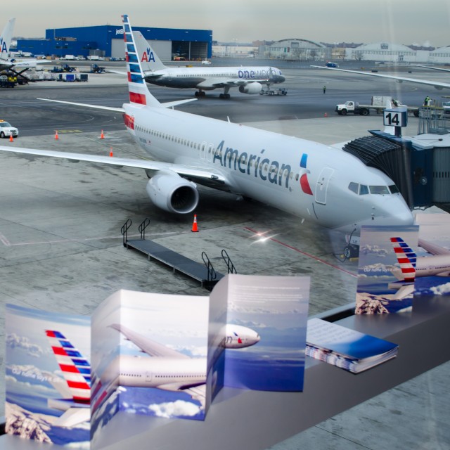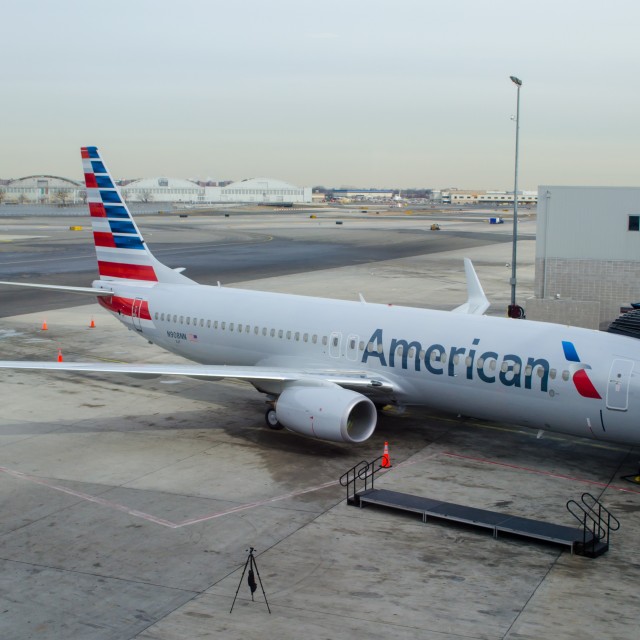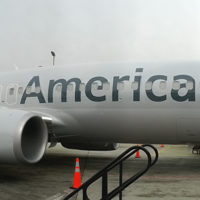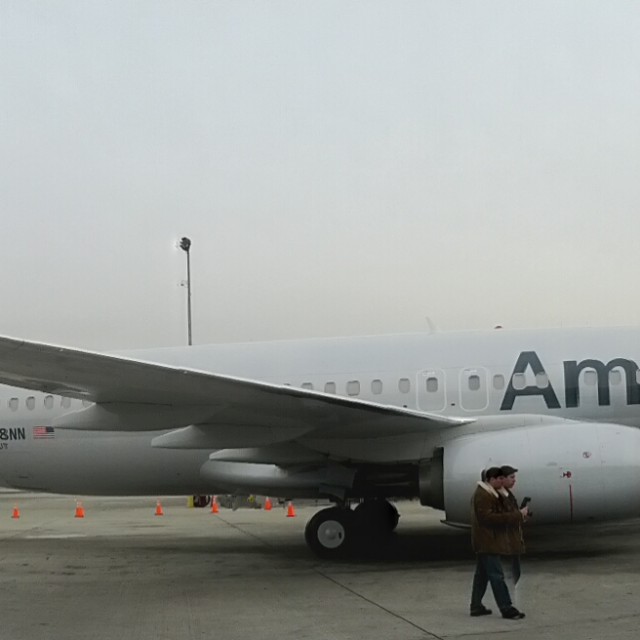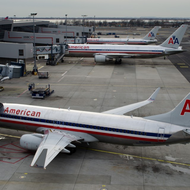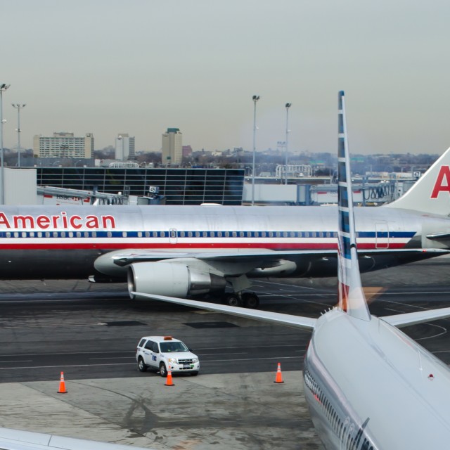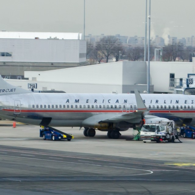
American Airlines Boeing 737 (N803NN) with new livery seen for the first time in Seattle. Image by Brandon Farris.
I recently had the chance to see up close and personal the New American Airlines scheme when it arrived to Seattle-Tacoma International Airport (SEA) for the first time, and have to say, pictures do not do it justice. Previously I was quoted on AirlineReporter.com saying that the new design was,’œFugly.” You could say I was not a huge fan.
Seeing it person really makes a huge difference. The logo stands out on the front of the plane and reaches back just before the emergency exit. Then we get to the tail, from a distance it is not the sharpest looking thing in the world but up close American Airlines seems to have hit a home run with it. Though it looks like as one person described, drawn via a crayon, it is artistic looking compared to what has become the dull Red and Blue AA that has graced the tail for far too many years.
I have seen quite a few people say that the design will not stand out among the gray sky. Obviously, SEA is known for its gray sky and during the 737’s visit, it was surely gray, but the tail stood out. I couldn’t imagine what it will look like on a sunny day.

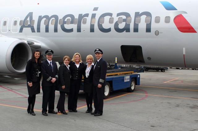
The American flight crew stopped to pose in front of the new American livery. Photo by Brandon Farris.
Everyone who was at SEA, from passengers flying through, to airport ground agents along with the TSA and FAA all seemed to make their way to the gate that it was parked at to take a sneak peak at the new scheme.
Many people working on the flight for American seemed to take a moment and bask in the new identity and even stopped for pictures. I also have to note that this was the happiest AA crew that I have ever seen and kinda wish more had their chipper personality (maybe this is truly the “new” American?).
Now with the merger coming on to the horizon, I for one, have to say that I cannot wait to see this new scheme on the A330 and think that it’ll be one of the best looking planes out there. Next thing we wanna see though is that tail on an MD-80.
If you have been able to see the new livery in person — has it changed your opinion?
MORE NEW AMERICAN LIVERY PHOTOS AT SEA:
[nggallery id=39]
 |
This story written by…Brandon Farris, Correspondent.
Brandon is an avid aviation geek based in Seattle. He got started in Photography and Reporting back in 2010. He loves to travel where ever he has to to cover the story and try to get the best darn shot possible.
@BrandonsBlog | RightStuffPhotography | Flickr |

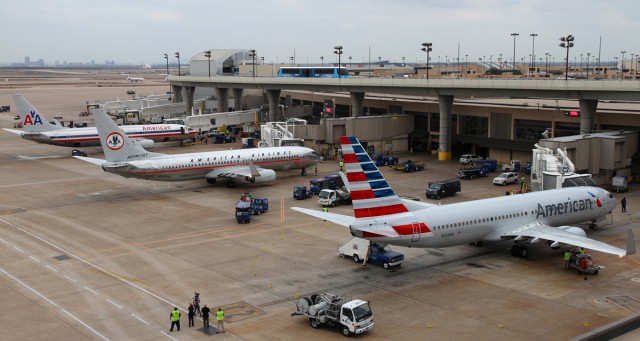
On the left is your last generation American Airlines livery. In the middle is the retro Astrojet livery (N951AA) and on the right is American’s new livery (N908NN). Photo by Joe Statz / JetPhoto.net
Joe Statz grabbed this picture of three liveries of American Airlines all lined up at Dallas Forth Worth International Airport (DFW) and was willing to share it with all of us to enjoy.
Yes. The Astrojet is an amazingly retro design, but I don’t think a fleet made to look like that today would go over too well. I think that the last American Airlines livery will also start to look more retro and classic, but again, is not a design made for 2013. I still think the new livery is surely not an evolution, but a revolution. I still like it.

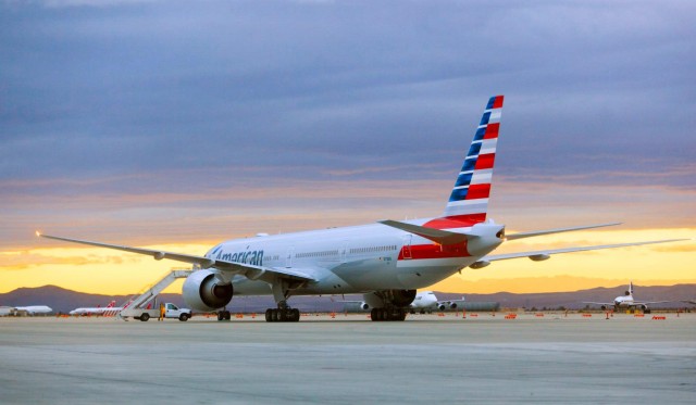
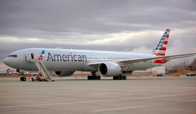
American Airline’s Boeing 777-300ER is shown in new livery. The aircraft (N718AN) was painted at Victorville Airport (VCV) in California. Check the classic Delta L1011 in the background. Image from American.
Next week American Airline’s first Boeing 777-300ER (77W) will fly from Dallas (DFW) to Sao Paulo Brazil (SAO) on the 31st of this month (which Chris Sloan from Airchive.com will be sharing his experience with AirlineReporter.com). Before then, it needed to be painted in American’s new livery and now it has. We have seen computer mock-ups of the 777 and a real 737 in the livery, but now we can see the 777-300ER in its new threads. The big question: Is it growing on you?
Other American Livery Stories:
Now, American is pretty good at making interesting videos. I would assume that one is in process showing the 777 being painted, so maybe we will be seeing one soon.

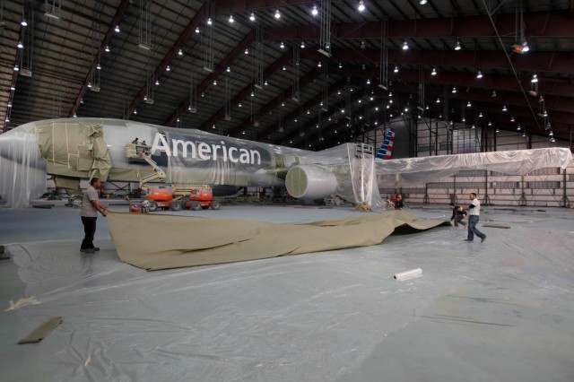
American’s Boeing 77W inside the paint hangar. Image from America.

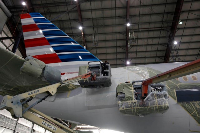
The tail seems to be many folks least favorite part of the livery. Not quite sure why. Image from American.

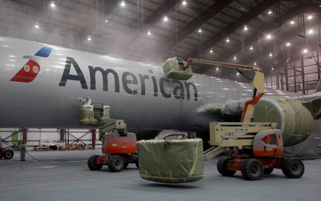
American Airlines 777 being painted in Victorville. Image from American.

The 77W looks ready to fly. Check out the Wi-Fi antenna up top. Image from American.
Want more? ADDITIONAL AMERICAN AIRLINES BOEING 777-300ER PHOTOS via their Facebook.
Terminal 8 at John F. Kennedy Airport in New York yesterday hosted a special event: the first American Airlines plane with the company’s new livery was in town. The 737-800 is the first American aircraft with the new livery, but a Boeing 777-300 ER, the carriers new flagship aircraft, is being painted right now and we should see it before its maiden flight to Sao Paulo on January 31st.
With members of the media invited, American Airlines talked about the change to their iconic livery, and what it means for the brands future. In general, most people I spoke with like the change, though some were a bit reluctant to accept the new tail design.
After seeing it in person, I am torn over this new livery. I like a the look of the body of the aircraft, but the tail leaves a bit to be desired. There is a lot of detail in the paint on the tail, but most of it is lost at a distance. The engines and winglets also need something to tie it all together.
Check out some close up shots of the new paint below, you might just see some details you didn’t notice before. With a bit more time to process; what do you think about the new livery?
Read some more about this event and AA’s reaction to criticism of the design over at APEX.com.
-

-
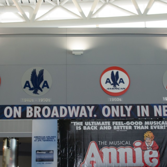
Time to update the AA logo history in T8, JFK.
-

-
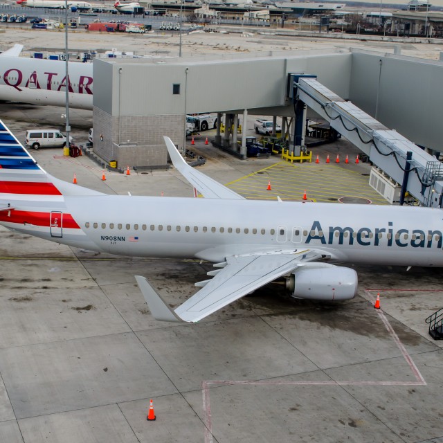
American Airlines 737 featuring the new livery, as seen from above in the operations tower.
-

-
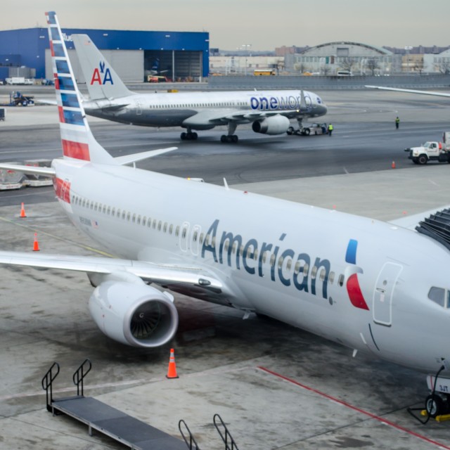
I wonder what the One World livery will look like when it is updated?
-

-
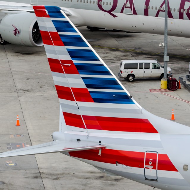
American Airlines 737 tail featuring the new livery, as seen from above in the operations tower.
-

-
The new American Airlines tail design, close up. Much more detail here than you see from a distance.
-

-
The new American Airlines tail design
-

-
The new American Airlines tail design
-

-

-
American 737 with the new livery, and a promo poster for the upcoming Boeing 777-300ER
-

-

-
Panorama
-

-

-
Say goodbye, old livery!
-

-
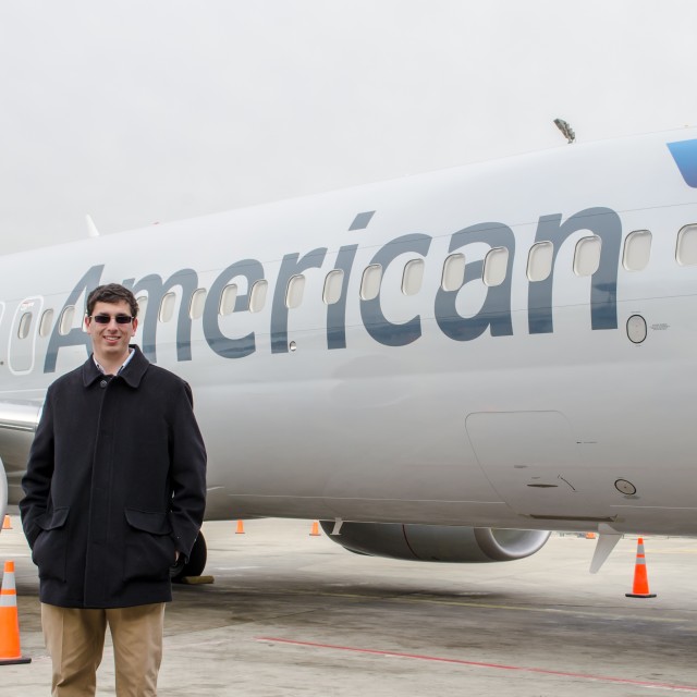
That’s me!
-

-
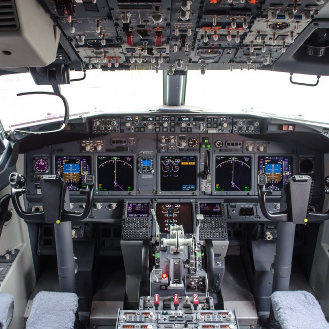
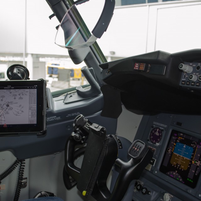
Flight deck of the Boeing 737
-

-
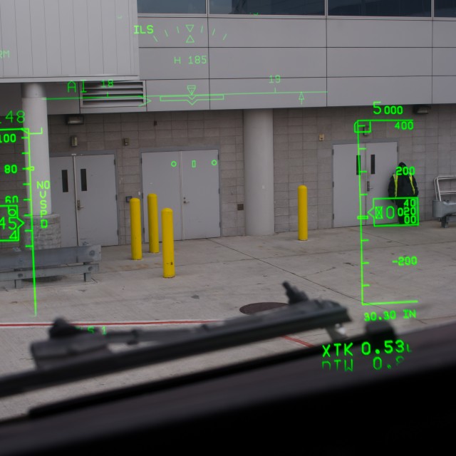
Heads up display on the Boeing 737
-

-
Left seat of the 737, fully stocked with an iPad for the electronic flight bag
-

-
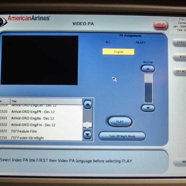
PA system controls
-

-
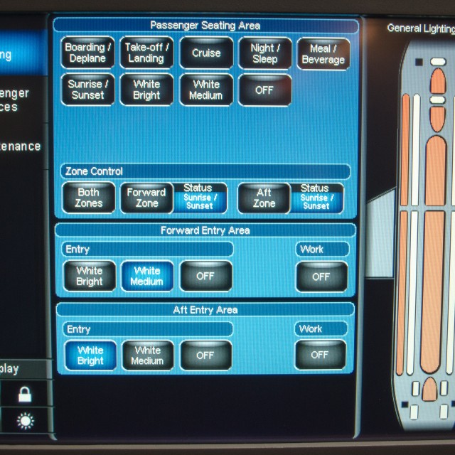
Boeing Sky Interior controls
-

-
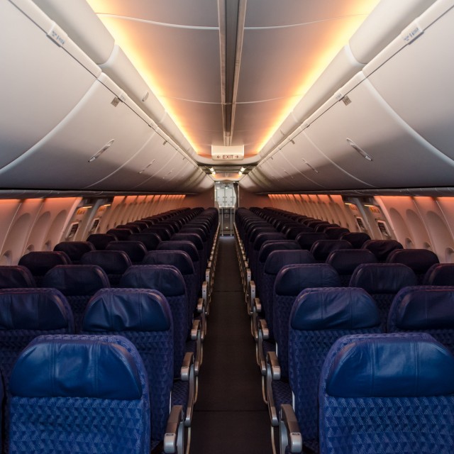
Boeing Sky Interior
-

-
Old and New
-

-
The American Astro Jet showed up!
 |
This story written by… Jason Rabinowitz, Correspondent.
Jason is a New York City native who has grown up in the shadow of JFK International Airport. A true “avgeek”, he enjoys plane spotting and photography, as well taking any opportunity he can get to fly on an aircraft.
@AirlineFyer | FaceBook | |

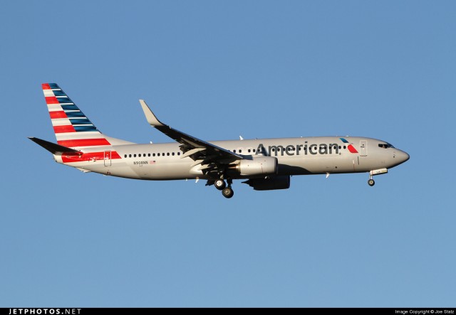
American Airline’s new livery on an actual aircraft: Boeing 737-800 (N908NN). Photo by Joe Statz. Click for Larger.
After some additional thoughts on the livery, I wanted to do a second post. I like American Airline’s new livery. Don’t hate me. It seems that most #AvGeeks out there aren’t huge fans. I have to say I wasn’t too sure when seeing the mock-ups of the Boeing 777-300ER, but seeing the livery on a real plane (via photo above), I have to say I like it.
Quite a few people around the internet like the concept, but hate the tail. But looking at this close-up photo of the tail makes me like it even more. I have also seen quite a few people complain that the tail only has 12 stripes versus the actual American flag having 13. No, this is not some conspiracy to over-throw the government. It is pretty obvious that the tail is a representation of the American flag and not an exact duplicate. I mean come on folks. Even US Airway’s flag on their tail has nine stripes, not the proper colors and no stars. Colgan Air had 6.5 (I think) stripes and only five stars.
BONUS: Quite a few additional “real” photos of the new American Airlines livery from USAToday
I come from the perspective of not liking their bare aluminum livery, which I know if loved by most people. Yes, it is classic, but it looks dated to me and made the airline look old (doesn’t help when it is on old planes). But American is making quite a few changes (merger with US Airways or not) and I think this livery matches their desire to change and move into the future.
I asked some of the other AirlineReporter.com writing staff their thoughts:
- “It’s boldly patriotic, a welcome and classy update,” Nick Smith.
- “I neither love it Nor hate it, it is a livery that is eye catching on the tail but still fairly plain. The new American logo reminds me of the tail design used on Aeroflot and i have heard references to numerous other similarities. The biggest thing this livery reminds me of is Virgin Australia using the southern cross on its tail as a bit of a patriotic feel, and that was just horrible to look at, hopefully this new AA livery makes some people happy,” Malcolm Muir.
- “Americans new livery is refreshing, to say the least. However, the design of the tail could use some tweaking. Something on the engines would be nice, too,” Jason Rabinowitz.
- “It’s fugly. The logo is amazing though and I love that but the tail just kills it. But I am sure, like JAL’s new scheme, it’ll grow on me. I feel that up-close the tail looks amazing. From a distance it’s an eye-sore,” Brandon Farris.
- “It’s bold to say the least. I know that American wanted to do something dramatic to drum up interest as they work their way out of bankruptcy (or via a merger). It’s not a bad livery but it just seems like the tail is a bit over the top and could have been simplified,” Colin Cook.
- “I have to say that I am really like the livery. It’s minimalist and retro at the front. The stripes on the tail definitely makes me think “America! Heck Yeah!” and I’m okay with that. Business in the front, party in the back. And like the mullet, very American,” Temo Madrigal.

Look at these two. The new livery on the left and old on the right. Which one looks more modern? This give you second thoughts? Images- Left: Joe Statz Right: Caribb
Give it time. Like Brandon, I remember when I first saw the new JAL livery in concept form. I thought the airline had lost their mind. Seeing it in a photo, it was a bit better, but it really took seeing it in person (and a few months) to fully appreciate it.
There are many people out there who have a long-love for American and seeing such a dramatic change is challenging — I get it. But with the loss of so many airlines and liveries over the years, I think most will also learn to appreciate this livery. Trust me. My guess is it will grow on you — maybe.
And a huge thanks to Joe Statz for letting us use his great American Airlines Boeing 737 photo posted on JetPhotos.net.
 |
This story written by…David Parker Brown, Editor & Founder. David started AirlineReporter.com in the summer of 2008, but has had a passion for aviation since he was a kid. Born and raised in the Seattle area (where he is currently based) has surely had an influence and he couldn’t imagine living anywhere else in the world.
@AirlineReporter | Flickr | YouTube |
